今天小编为大家介绍illustrator绘制超漂亮的卡通风格的插画海报方法,教程绘制出来的效果真的很棒,本教程主要是向大家介绍了设计思路,希望能对大家有所帮助!
本文原作者是Sasha Barr;是一位西雅图的插画家,擅长用粗糙的纹理、来源于自然的手绘花纹及事物、奇妙的颜色搭配。下面是他的一张海报的设计过程!这个海报是为宣传“Band of Horses”这个曲子而做。翻译的不好,有错误的地方可参看英文部分。

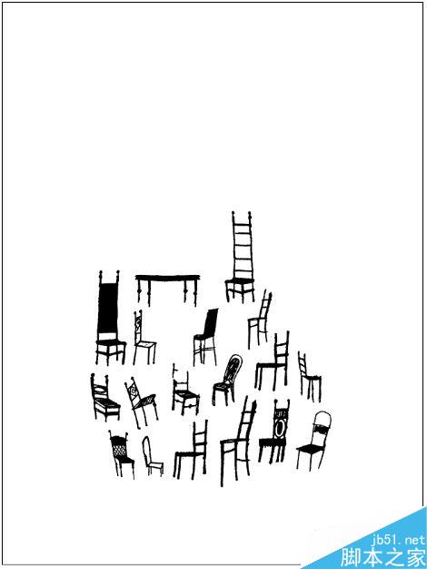
I saw an image in an old design annual of some chairs, so my spark sort of started with that. I started with these, thinking I could make something cool with them. I work almost exclusively in Illustrator, so I always turn everything in to vectors.
我在一个旧的椅子设计年鉴上看到一张图,所以我的灵感从这里开始了。我想我能够用这些作一些很cool的东西,我做任何东西基本都在 Illustrator里,所以习惯把所有的东西全部转换成矢量图形。

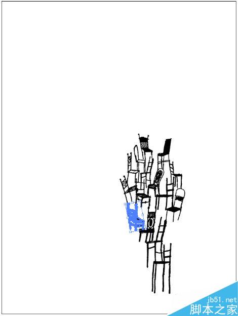
Here I’ve started to pile up the chairs, not really knowing where it’s going, but it seems like a good idea. My last couple of posters have been particularly busy with line work (Album Leaf & Sub Pop CMJ Showcase), so this time around I wanted to keep it open and simple (and quick).
这里我开始把椅子堆起来,虽然并不知道该摆在哪里,但是感觉应该是个好想法。我最近的一组海报里面的元素都是复杂的线条,所以这次我想要简单一点。

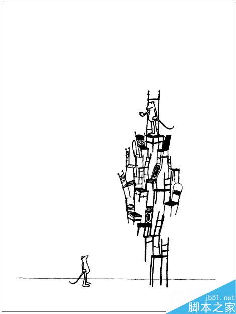
I put in a little sketch of a this mouse guy here (the one on the bottom, also now in vectors), multiplied/ rearranged him, and put the second one on the top of the chair pile. I also added the straight line at the bottom to create some ground. I think this is cool image, but it’s not really doing it for me at this point.
我手绘了一个小老鼠,一个在上面,一个在下面,我又加了一条线想要制作一个地面,我觉得这是一个很cool的画面,但是这跟我想要表达的主题没什么关系。

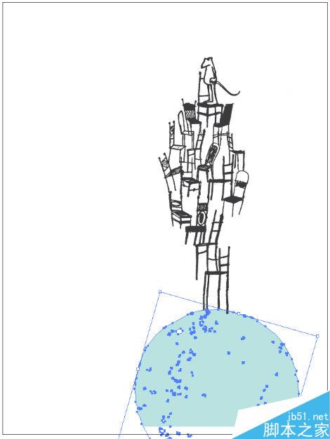
I have a bank of all kinds of vectors I pull from when working on projects; here I’ve added a circle shape to the bottom of the chair pile, while removing the lower mouse character. At this point I’m creating a better idea of what’s happening with the poster, I’m imagining the stacked chairs & mouse on top of a large head, almost as if it’s coming out of the head.


